ProofFlow
Creative direction and internal product positioning for an enterprise workflow application.
Context
ProofFlow is an internal workflow application used within a high-volume enterprise environment to streamline proofing and approval processes.
While the underlying functionality addressed real operational needs, early adoption was hindered by:
inconsistent communication
unclear value framing
lack of visual and language cohesion
The challenge was not improving the tool itself, but improving how it was understood and trusted by users.
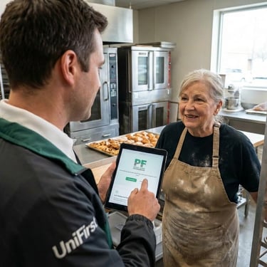
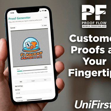
Representative Applications
Role
Creative Director (Internal Product Positioning)
Responsible for defining the product’s visual language, communication strategy, and adoption-facing materials to support internal rollout and sustained use.
The Core Problem
Internal tools often fail not because they lack capability, but because they lack clarity and credibility.
In this case:
Users did not understand when or why to use the tool
Value was communicated inconsistently across teams
The interface and supporting materials did not reinforce confidence or ease of use
Adoption friction was a communication problem, not a technical one.
The Decision
The creative direction focused on treating ProofFlow as a trusted internal product, not a temporary utility.
This meant:
Establishing a clear product identity
Framing the tool around outcomes rather than features
Creating a consistent visual and language system that aligned with enterprise expectations
The goal was to reduce cognitive load and encourage adoption through familiarity and confidence.
The System
Creative direction established:
A restrained visual identity appropriate for enterprise use
Clear naming and hierarchy within the interface and supporting materials
Consistent language patterns for instructions, alerts, and status states
Presentation standards for internal documentation and training materials
The system was designed to scale across teams without ongoing creative oversight.
Implementation
The direction was applied across:
Interface presentation
Internal rollout materials
Training documentation
Adoption-facing communication
Each touchpoint reinforced the same principles: clarity, consistency, and trust.
Outcome
The refined positioning improved internal understanding of the tool’s purpose and value, contributing to smoother adoption and more consistent use across teams.
More importantly, it repositioned ProofFlow as a reliable internal product, rather than an ad hoc solution.