MSB - Main Street Batesville
Brand modernization and identity system rationalization for a civic organization.
Context
Main Street Batesville is a civic organization responsible for promoting downtown economic activity, supporting local businesses, and maintaining a recognizable public presence across events, partnerships, and community communications.
The existing identity had accumulated over time and reflected multiple eras, contributors, and priorities. While familiar to some audiences, it lacked consistency, clarity, and adaptability across modern touchpoints.
The challenge was not to “rebrand,” but to modernize responsibly; hopefully preserving trust while improving usability and coherence.

Representative Applications
Role
Creative Director
Responsible for strategic direction, identity system design, and decision-making across visual standards and applications.
The Core Problem
The organization needed an identity that could:
Remain recognizable to the community
Scale across digital, print, and physical environments
Support long-term use by non-designers
Avoid appearing trend-driven or overly commercial
In short, the identity needed to function as civic infrastructure, not marketing.
The Decision
Rather than pursuing a full aesthetic reset, the decision was made to rationalize the existing identity system.
This meant:
Preserving recognizable elements
Reducing visual noise
Establishing clear rules for usage
Creating a flexible framework that could evolve over time
The goal was continuity with improvement; not novelty.
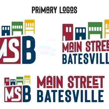
The System
The updated identity was designed as a modular system, built around:
A simplified and more consistent logo structure
Clear typographic hierarchy for public-facing communications
A restrained color palette that balanced warmth and authority
Scalable applications for events, signage, digital platforms, and partner use
Every element was evaluated against one question:
Will this still make sense five years from now, in hands other than my own?
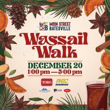
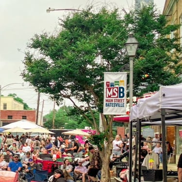
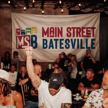
Implementation
The system was applied across key touchpoints, including:
Primary organizational branding
Event materials and promotional assets
Digital platforms and templates
Community-facing signage and communications
Care was taken to ensure the system could be maintained internally without constant creative intervention.
Outcome
The resulting identity:
Improved consistency across channels
Increased clarity for both internal and external use
Preserved community recognition while modernizing execution
Established a durable foundation for future growth